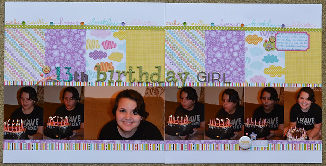
Another layout for the Photo Arrangement Replay class. I can't get over how much I like this class and even though it's over I still have lots of sketches to use from it. If you are looking into taking a sketch class to get your creative mojo working take this one.

My niece last year, it's still hard to believe she's a teenager. This layout was a little challenging because she's at that age you don't want to really use cutesy papers, yet more grown up looking lines don't really work either. I ended up going with Bella Blvd.'s Sunshine and Happiness. There isn't a lot left to say because I wanted to keep the embellishments to a minimum. The papers and stamping along the top were enough, I didn't want a lot more to compete for the focus, which I wanted to be the photos.
I will admit that it isn't my most favorite layout ever, not all of them can be though. It's cute and a little quirky, just like my niece.
Thanks for stopping by!

Awesome two page layout! Love the pp's and the colors!
ReplyDeleteAnother beautifullayout, love the colors !
ReplyDeleteGreat double pager! Love the little words at the top!
ReplyDelete