Friday, October 31, 2014

Halloween Banner - Process Video

Hi! Long time no see. I promise there is a reason for that and I will explain what I can after the results are back from my son's latest round of testing.

For now let's get into today's project. I have a little Halloween Banner process video. Yes, today is Halloween but I figured better late than never and you change the theme to whatever you need.

Here it is in all it's glory. Okay, so it isn't a large banner. It is the start of what I want to happen with this mirror. It's in the entry and will feature a nice little Halloween vignette eventually. My plan is to add a little something every year to make this a show piece for when we have trick-or-treaters.

Here is a little more of a close-up shot for you. It's super cute in person. Why is it that projects never really show up as well in photos? Seems like a new hashtag just waiting to be born, #scrapbookerproblems.

And an even closer shot to give you an idea of some of the details and dimension.

Finally, the video.

Thank you so much for stopping by and stay tuned for more projects coming soon!

Sunday, June 1, 2014

Daddy is the Best Jungle Gym - SG Blog Hop

Hello! I'm excited to be back in the SG sketch blog hop, I took off for the last one and I missed it. Let's jump in to the good stuff shall we?


Welcome to the Scrapbook Generation Blog Hop for June. If this is your first stop, you might like to start at the Scrapbook Generation blog and then hop through each link.


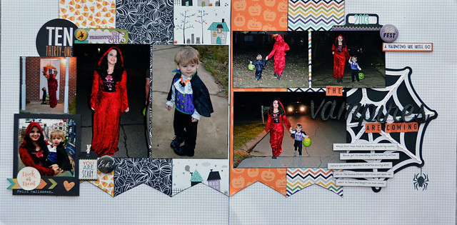
My sketch comes from the downloads. There is a slight snag, it isn't in the new store and I didn't think to check before starting this blog post to make sure it was there. It was from October according to the file name, and was a single page sketch. The main difference I made, besides ignoring their embellishments completely, was to make the center photo larger. I really wanted it to stand out and the be the focal point, if you look closely at my husband and son you'll see why. I just couldn't let those faces be any smaller.

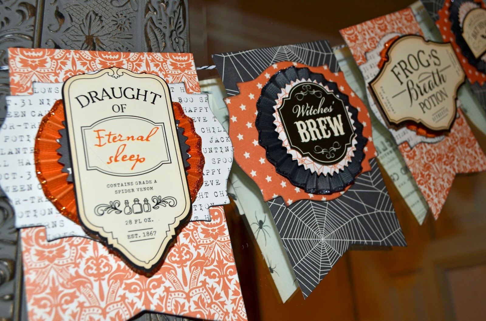
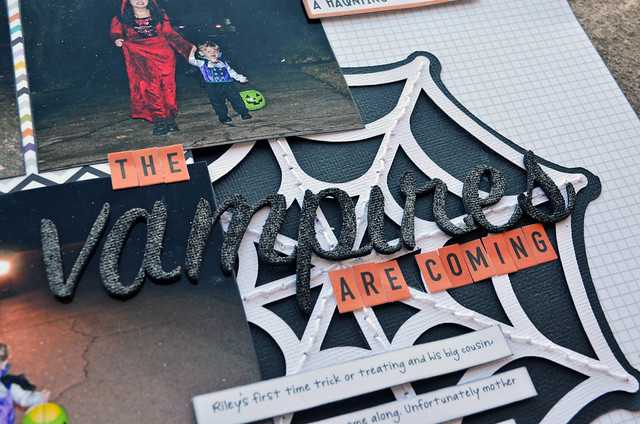
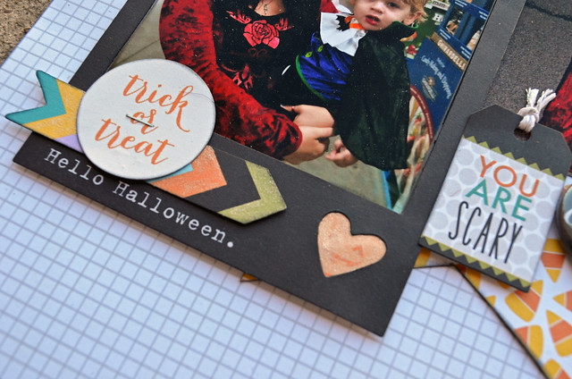
Here are a few close-ups. I really loved playing around with my embellishment clusters for this layout. All of those label stickers you see tucked in have been in my stash for a number of years, remember Scenic Route, and it was satisfying to actually use them.


I even tried out a new method of dating the layout. Normally I would just use a roller date stamp and a label but the actual day wasn't important. The geotag tells you it was a night in NYC, which was only one of 4 that year, it wouldn't be hard to narrow it down. This did happen to be the first night and I'll add journaling later explaining that, for some reason I don't always add journaling before blogging.


That's it from me so I'll thank you for stopping by! Also if you like process video check out my posts from last month and you'll find a couple from me. It's a new thing that I'm so very excited to be doing.

You can find the SG sketches in their books and as downloads in the SG store, and there is a free one every month in case you wanted to try it out.

Next on the hop is Lori, leave a comment on each blog and one lucky commenter will receive a free sketch bundle of their choice from the store. The winner will be drawn on Monday, June 9th which leaves you one week to leave a comment.

In case you get lost at any point, here is the list all the blogs
Scrapbook Generation blog
Ruth
Steffanie
Devra
Cassie
Stephanie
Michelle
Katy
Tina Gale
Corrina
Casandra
 Lori
Tasha *ME*
 Lori
 Cicily

Saturday, May 31, 2014

So Not Funny - Layout + Video

Hello. I'm here with another process video. This is also a sketch from the Big Picture Classes, Sketch Solutions class.

And a quick close-up of my main embellishment cluster.

On to the video. Thanks so much for stopping by!

Monday, May 26, 2014

First Checkup - DT layout

Back with another two page sketch from Stick It Down. I adored this months sketch and had a blast working with it to create a cute page about little guys first visit to the doctor. Which ended up being a major event. His peditrian's wife is also a pediatrician and was having an article written about her in the local paper. They needed a child for a photo op and asked if Riley could be in the picture. It was so neat seeing him in the paper, even if he was very unhappy in the photo.

First let's look at the sketch.

And here is my take on it. Along with a couple of close ups.

I did change a few things up, like turning the three strips of paper into one. I almost cut the plaid paper into three strips to give the same look but in the end it was so cute I had to leave it intact. The rest is fairly similar. I did make my focal photo larger and stacked my square photo the opposite way. There are times when I use a sketch and by the end you can't even tell they are related, this I think you can.

Thank you so much for dropping by! If you are new or missed yesterdays post you might want to check it out, it includes my very first process video.

Storytime with Nonna - Layout + Video

I'm here with my very first process video. I'll warn you that it's jumpy and a little all over the place but it's done and I hope to just keep getting better.


Sunday, May 11, 2014

Wood Veneer Storage Solution - Video

Here is a little video on how I now store my wood veneer. I've tested it out for a few months and even took it along on a scrapbooking weekend trip and it worked beautifully.

It's a fantastic solution that holds even the tiniest of piece in place. Plus, it's completely customizable for all of the larger designs that have been coming out more recently.


Amazon link to Storage Case.
Hobby Lobby link to Storage Case.

I do apologize for my recent hiatus, my son's birthday party took up a lot of my time and I haven't had much free time since. I'll be back with regular layouts and more storage posts soon. Thank you so much for stopping by!

Tuesday, March 25, 2014

Peach Picking - DT Layout

It is the last Tuesday of the month, that means it's time for a new Double Page sketch from Stick It Down.


This sketch was lots of fun to work with. The only problem I had was trying to find pictures that fit the current arrangement. I had the perfect picture for the largest spot, only it would have looked off the page instead of towards the title, the look I prefer. While most of the time you can simply use photo editing software to flip your photo to orient it in the way you want, you can't when there is writing visible. So I flipped the sketch to accommodate my pictures.


Now it fits my photos perfectly. This year I have a goal of using some older product and decided these photos would be the perfect opportunity for some stash digging. I finally settled on mostly old Echo Park, all but the dot in the background and the large cloud are from their first collection Sweet Summertime. Talk about a blast from the past! The cloud paper is from Echo Park's Summer Days collection, and the small polka dot you can see around the edge is from Snap by Simple Stories.


 The butterfly is a stamp and die combo from Papertrey Ink, another quite old product. You can't really tell but I went over the stamped portion with my Wink of Stella clear glitter brush pen. Leaving the white edge plain really gives the butterflies the look of a pre-made embellishment.


Thanks so much for stopping by!

Tuesday, March 11, 2014

Steppin' Out - Layout

Hello again! I'm here with a current favorite layout. These photos were taken when we were walking from The Guggenheim to The Met, my son was acting like his normal crazy self and I had to document it. These types of everyday layout are my favorite.

I used a sketch from Scrapbook Generations One-Page sketches Volume 1. I'm trying to incorporate layering more in my layouts again. This layout is the perfect example of how layering and embellishment clusters don't have to be over the top and complicated, sometimes simple is better.

There is a nice close up of a basic embellishment cluster, a shape for the base, an element with writing, a sticker with writing and enamel dots finish it off. You can see that I've made sure to follow this same pattern in three different areas. The journaling is another that I didn't get a close up of, you can see though the same elements are there just a tiny bit more spread out and almost appear to frame the journaling. Framing key areas is something I like to do, you can see another example of this in the next photo.

This final cluster is just slightly different. I didn't have an element with writing left that I really liked, like the "so random" and "always an adventure" pieces that I used in the other two clusters. I went through my stamp collection and came up with "pure joy" from Elle's studio and it was the perfect giving me the element with writing to finish off the cluster beautifully. Originally I had it stamped and cut out of a piece of plain cardstock to give me the same look as the other pieces but in the end I wanted to keep the pattern of that green chevron paper and it turned out cute.

Thanks so much for stopping by!

Monday, March 3, 2014

Hello Roomie - Layout

Can you believe I've been scrapping well over a decade and I haven't made a single page that was just for me? I've made pages for my niece, vacations, etc. But, nothing that was just mine and something no one else would really care about. That changed last week.

I'm on the left and Stephanie is on the right. We belong to a message board that is rather close knit and a large group, almost 50 people, met up at a scrapbooking retreat. Stephanie was gracious enough to be my roommate and it was so much fun getting to know her in person.

If you ever have a chance to go to a scrapbooking retreat you should try it. Getting to set up for a crop and have several days to work on things was great. It was so much fun that I'm signed up for another multi-day crop, not a retreat but close, in May.

This layout uses a sketch from the Scrapbook Generation One-Page sketches, Volume 1.

Thanks for stopping by

Friday, February 28, 2014

First Subway Ride - Layout

Hello, all! I'm back with another travel layout. At the rate I'm going I might have this trip scrapped in about 10 years. That is just fine with me, makes sure I have something to work on all the time.

I used a Scrapbook Generation sketch from the One-Page Sketches, Volume 2 book. Using their sketches really helps to speed up my process, any sketch does really but have the photo sizes printed for me helps the most.

I honestly thought subways in NYC would be scary, but really they aren't. The only issue we had was routes aren't really clearly marked, if you are used to public transportation maybe it would be easier for you. These Arkansas folks that have to drive their own car to get anywhere, are not. I'm used to signs tell me to turn here, or there, to find a landmark and there wasn't anything like that. On the inside there is a map that lights up to which stop you are at, I really wish they would have that same type of map on the platforms so you know which side to use. You would think a grid system, like the streets of NYC, would be easy to navigate but I guess we are just too used to our own system down here. I'm sure if we had gone on more than one ride we would have gotten the hang of, at least I hope so.

On to the layout. I used mostly Simple Stories Urban Traveler. I do have a tiny bit of October Afternoon and Thickers from American Crafts. I also used stamps from Technique Tuesday, October Afternoon and Stampin' Up!.

I'm starting to get back into clustering more around my titles, it's a look that I really love and have gotten a tiny bit away from. This was my way to slightly ease back into it and I'll have more next week that I add even more.

Thanks so much for stopping by!

Tuesday, February 25, 2014

The Vampires are Coming - DT Layout

Hello all! Another month means another Stick It Down double page sketch. This one was a blast to work on and I know as soon as I saw it any layout made from that sketch would look fantastic.

Here is the sketch.

I still love the banner look and knew it would be perfect for pictures of my son and niece trick or treating.

They are so cute in their coordinating vampire costumes. You can see I stuck pretty close to the sketch, it is missing the top stripe piece but I had quite a big of multicolored patterned paper and didn't think it need the extra pop. That spot with the doily was just itching to be replaced with a spiderweb, that was cut from my Cameo and I did some hand-stitching to give it texture.

My title blends a little and that was done on purpose. The Bella Blvd. Trick or Treat collection had a lot of pattern and color, I didn't want my title to battle it out with the other elements. I did add a little extra big of glitz with my Wink of Stella glitter pen in clear, I love that thing and you can see more glitz I added in the next photo.

I used it to glam up three of the colors in the arrow piece and my little happy pumpkin peeking through the heart. It is so incredibly easy to go overboard with thing, I highly recommend it to everyone.

That wraps it up for this months Stick It Down sketch. Thanks so much for stopping by!

Tuesday, January 28, 2014

Flying High With Daddy - DT layout

It's time for my first layout with the Stick It Down DT. I'm nervous and excited at the same time.

Let's jump right into the sketch and layout.

I loved this sketch, it includes some of my favorite elements such as a large background and banner pieces. It wasn't hard to make something adorable with it.

Here is my layout. You can see I kept it pretty close to the sketch but I don't have a large strip going down the left side. To make up for that I took my embellishment cluster and brought it up to the title creating a sort of vertical element. It's ok to leave something out or add something else to a sketch, they are guidelines, not hard and fast rules.

Thanks for stopping by and I hope you will play along with the Stick It Down February double page sketch.