Monday, September 23, 2013

At the Patch - Layout

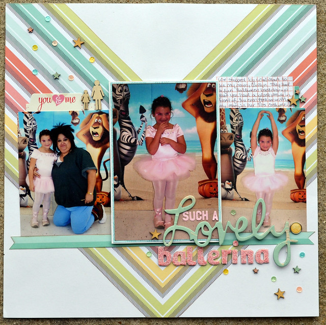
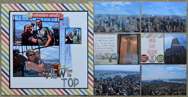
Hello, happy fall! To celebrate the changing of the season I'm here with a fall themed layout. These pictures were of Riley's first trip to a pumpkin patch.

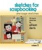
I used a sketch from Scrapbook Generation, Sketches for Scrapbooking: One Page Sketches, Volume 2. Say that 10 times fast.

At the Patch layout

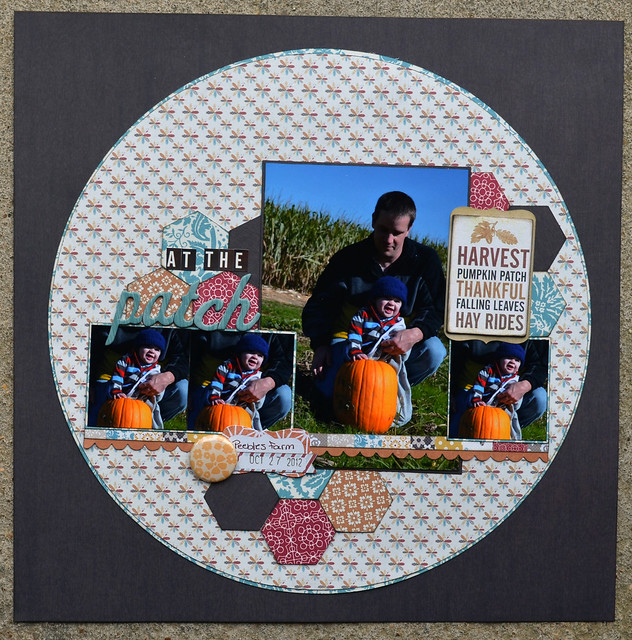
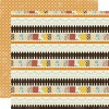
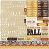
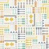
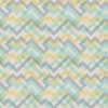
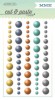
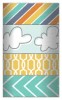
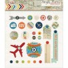
I loved the Lily Bee collection, Autumn Spice. With a very young child last year I didn't have time to make layouts and sadly the beautiful papers sat unused. Just because the collection came out a year ago that doesn't mean it isn't as stunning now as it was then. Some new embellishments went perfectly, I love mixing older products with something brand spankin' new.

At the Patch title close-up

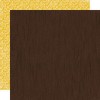
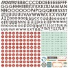
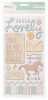
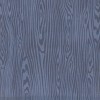
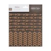
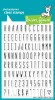
It also gave me a chance to use some much older Thickers. I'm a sucker for anything woodgrain and bought these as soon as they hit the market, over two years ago. Wow, I really need to use things a little bit faster.

At the Patch embellishment close-up

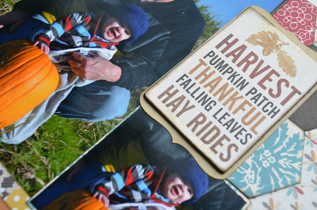
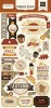
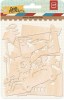
The main embellishment was this large chipboard piece, but the shape just wasn't working for me. I layered it on a sticker from the same collection, that worked much better for my page. You'll notice there really isn't much embellishment at all, the papers were so pretty that I didn't want to cover too much up.

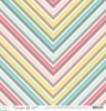
Autumn Spice is still easily found and I encourage you to give it a look if you haven't before. It looks great on the screen and in person it's simply stunning. The woodgain paper I used as the background is the best I've come across, I'll be buying more of that for sure.

Thanks for stopping by. Supply list below.

Monday, September 16, 2013

Such a Lovely Ballerina - Layout

This layout was heavily influenced by MercyTiara, also known as Tracy. The piece of paper from Dear Lizzy she used was perfect for a layout of my niece at Halloween quite a few years ago. I really wish that manufacturers would put out Halloween collections that are a bit more girly, at least every few years. While I love the way this turned out I would have also loved to use a collection with bits and pieces more geared to the holiday. Oh well, in the end it's cute and girly, just perfect for the photos.

Such a Lovely Ballerina

Oh how I miss those days giggly little ballerina days. This is actually the second layout I've done for the same year, and I have another to go. The first one was made from her school party, where they have a parade of costumes. Here it is using mostly Echo Park's Little Girl collection. It's quite an old layout, here is the direct link to it in the two peas gallery.

Thankfully my layout photo taking skills have improved.

Thanks for stopping by, supply list below. Note: The links provided are NOT affiliate links, it's just easier for me to share this way rather than type a long list out.

Friday, September 13, 2013

Chasing Pigeons - Layout

Back with another NYC layout. My son saw the pigeons in front of the Plaza and couldn't resist the urge to chase them around. People sitting around were getting a kick out of watching him try his best to catch a pigeon.

Chasing Pigeons

This started with a sketch from the Scrapbook Generations One Page Sketches, Volume 2 book. My favorite of all the books and a great addition to your scrappy library, if you are a single page scrapper.

Normally when working with a sketch I don't use the same type of embellishment called for, for example a lot seem to have flowers which is something I rarely use anymore. This time I did use the arrows called for, it seemed to be a good fit for the crazy pigeon chase.

Thanks for stopping by.

Thursday, September 12, 2013

View from the Top

This is the first layout I've made for our NYC trip and the first using my new sketch book, Sketch Magic.

I love this book. Really I love all my Scrapbook Generation Sketch books, but it's always fun to see what changes they make to each book. They seem to include more little "bits" or embellishment spots than before, making it easier than ever to crank pages out that look stunning.

For this layout I used Sketch #7 and tweaked it just a bit to better work with my photos and ephemera.

View from the Top

This is the also the first time I've used an insert. I even had to make my own page protector since there aren't any that I've seen to fit a brochure. Seems like something that is missing from the scrapbooking market, I can't be the only one that has used a standard size brochure as an insert. I used a 12x12 page protector cut down for this one, only because I didn't have any 8.5x11 on hand. Those would have worked just as well.

View from the Top Insert front

From the back. I would like to say that the patterned paper strip was purely decorative, but mainly it's there to hide my adhesive. I did decide to dress it up a bit to make it look purely decorative. Only we know the truth, don't tell.

View from the Top Insert back

And a here are a couple of photos of the individual sides.

View from the Top Left
View from the Top Right

Thanks for stopping by.