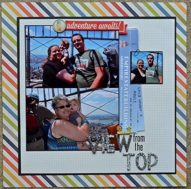
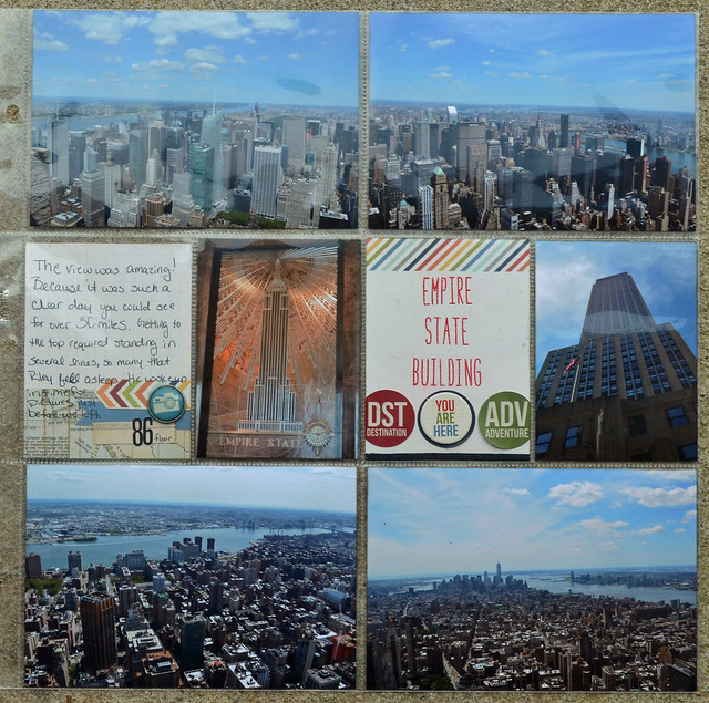
This is the first layout I've made for our NYC trip and the first using my new sketch book, Sketch Magic.
I love this book. Really I love all my Scrapbook Generation Sketch books, but it's always fun to see what changes they make to each book. They seem to include more little "bits" or embellishment spots than before, making it easier than ever to crank pages out that look stunning.
For this layout I used Sketch #7 and tweaked it just a bit to better work with my photos and ephemera.
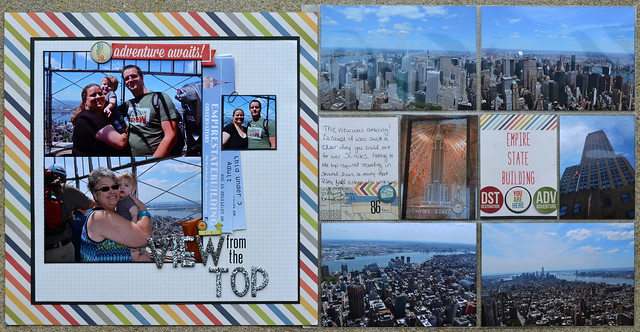
This is the also the first time I've used an insert. I even had to make my own page protector since there aren't any that I've seen to fit a brochure. Seems like something that is missing from the scrapbooking market, I can't be the only one that has used a standard size brochure as an insert. I used a 12x12 page protector cut down for this one, only because I didn't have any 8.5x11 on hand. Those would have worked just as well.
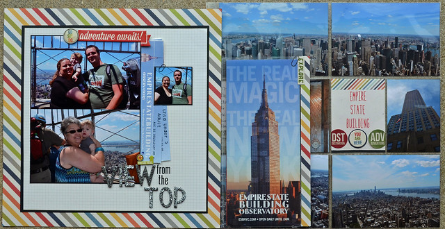
From the back. I would like to say that the patterned paper strip was purely decorative, but mainly it's there to hide my adhesive. I did decide to dress it up a bit to make it look purely decorative. Only we know the truth, don't tell.
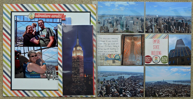
And a here are a couple of photos of the individual sides.
Thanks for stopping by.

Super cute, Tasha!
ReplyDeleteWay pretty! I keep thinking that I might want to get myself a package of those protectors just so I can do this kind of thing. This effect is super cool.
ReplyDeleteGreat layout :)
ReplyDeleteGreat layouts and gorgeous pictures!
ReplyDeleteFantastic layouts, wonderful photos too!
ReplyDeletebeautiful layout...everything about it
ReplyDelete