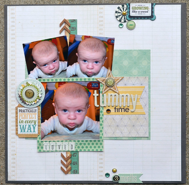
Two posts in one day isn't my usual style but I'm running out of time to link up to some challenges. For this layout I've played along with Let's Get Sketchy, October week 2.
I did change a few things up because I'm not usually an askew kinda girl. The top two photos are slanted but that was all my inner control freak would allow. One of these days I will be able to throw caution to wind and let paper and photos tilt, today is not that day.

Normally I mix lots of manufacturers on my layout and this one only has three, proving you can get more out of minimal supplies. I really wanted to see if I could like the end result with fewer lines being used and to my surprise, I did. It includes lot lots of embellishments, that poor brad pack took a beating on this layout. I'm happy with the stash usage here and it makes me feel less guilty about the amount of shopping I do.

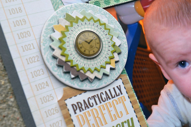
This is my favorite embellishment and also a great stash busing technique. That piece wasn't a favorite in the layered chipboard pack because of the design, the shape was great. I took the pinked circle off of the plain circle and recovered the pinked circle with paper from the same Echo Park collection. After gluing it back together and adding a couple of pieces from the brad pack I had the perfect embellishment for my page. I tend to forget that it's ok to change something if it doesn't work you and that silhouette head certainly didn't work me.
Thanks for stopping by!


I love everything about your layout! The little elements like the clock are prefect! Thanks for playing at LGS!
ReplyDeleteLove the LO the brads are an awesome touch! Thank you so much for playing along with us at LGS!!
ReplyDeleteBeautiful layout ! I also have a hard time to tilt things on my layouts...
ReplyDeleteGreat job on the sketch. I think it is a great idea to look at a sketch and put yourself and your interpretation into it.
ReplyDeleteFantastic page! Love all the embellishments. Thanks for sharing with us at LGS.
ReplyDeleteSuch a lovely page, I too find tilting pictures to be visually hard for me..I keep wanting to straighten then.
ReplyDeleteSuch a sweet page, fab take on the sketch and great use of products! Thanks for joining us at lgs!
ReplyDeleteLovely! The photos are just adorable! What a blessing to work with those! Thanks for sharing!
ReplyDeleteI love it! thanks for joining us at lgs!
ReplyDeleteLovely layout! I love it! Thanks for joining us at LGS!
ReplyDeleteWhat a cute little guy, and layout! Love it!
ReplyDeleteOh my gosh, I just love this layout! The pictures are adorable first of all, and you have an eye for embellishment placement, etc. It's awesome! Thanks for joining us at Let's Get Sketchy!
ReplyDeleteDarling layout, love the colors and the way you embellished it!
ReplyDeleteI love what you did with the sketch! What an absolutely precious layout! I love your patterns and colors, and how you used the products! Beautiful job! Thanks so much for joining us at Let's Get Sketchy!
ReplyDeletelove the sketch & your take on it x
ReplyDeleteOoh, well done for changing the embellie to suit your page! These photos are too cute for words! I have the same problem that I struggle to tilt stuff on my page, it just doesn't feel right to me! x
ReplyDeleteGorgeous work!
ReplyDelete