Hello, back with the my final layout from the Sketch Support class. If you are new to sketches or even if you are like me and use them all the time, I highly recommend this class. You can find it here.
For some reason I wasn't as into this sketch, probably because I had no photos ready that would have remotely came close to the dimensions of the ones given. I could have searched through all my digital files and found something but I wanted to get this done quickly. On to my layout.

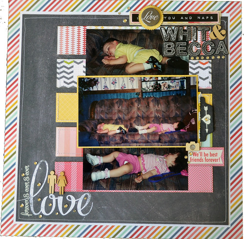
I chose to use the right side of the sketch for this one and tweaked it quite a bit. The photos are quite old, I believe they were taken in 2000, and are really dark. I decided to go with that and the first paper I chose was the Elle's Studio You and Me paper. I see people fighting dark, older photos by using everything light and bright and to me that just draws attention to the fact that they are dark. The layout does have a quite a few lighter patterned papers but the chalkboard paper helps to keep them in check.

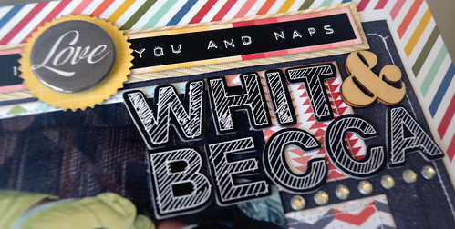
I love that sticker from Pebbles and it was the perfect accent for this page. It originally said "I like you and naps," but since the chalkboard paper said "love" I decided to use a piece of flair to change it to match my theme. The dark sticker and flair together competed, a little piece of yellow patterned paper cut from my smallest nestabilities pinked circles die set helps to separate them and lighten it up a bit. I matted the sticker with patterned paper and then matted it with ribbon to help set it off. The challenge for the week was add some finishing touches and she gives several examples of what to add. Since I usually do add finishing touches I challenged myself to add things that I normally don't like flair and ribbon. Can you believe this is the first piece of flair I've ever used? I have lot but it never ends up on my finished projects.

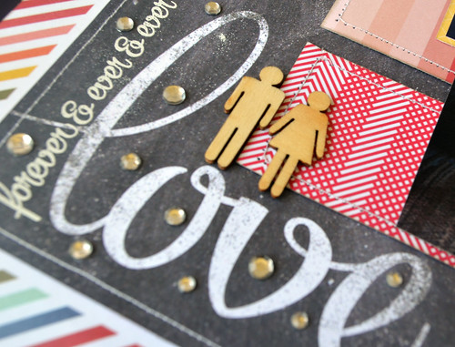
I also did some heat embossing, something that I really need to start doing again. It adds a little something without being overwhelming or taking away from the word on the patterned paper.

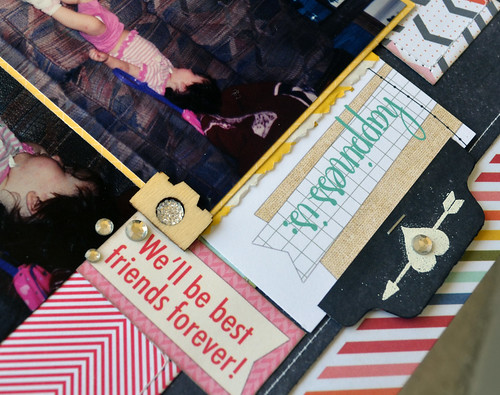
Last but not least I did a little embossing on the tag to pull out my hidden journaling. I couldn't figure out how to incorporate journaling into the actual layout so I tucked it away.
One thing I would like to point out is the focal photo has a lot of background in it, usually now I crop out distracting background to focus on the subject. However, I kept it this time because that was my Mother-In-Law's house, she passed away in 2006 and this house actually burned down I think it was four years ago. These photos are so precious because you can see little details of her life. I still miss her and she loved my scrapbooks, I would like to think she would like seeing her wallpaper and trinkets on display for everyone. If we keep going these little details will be lost and I'm here to tell you when they are gone you miss them.
Thanks for stopping by.

I just love this, teaming that chalkboard paper with the coloured border really looks fantastic and I love the little details. Great layout!
ReplyDeleteAdorable photos :-) and very cute details on your page!
ReplyDelete