I'm going through the Sketch Support Class with an online group. Maybe being with a group, that we loving refer to ourselves as "The Fizzlers", will help me actually complete this class. Chances aren't great but it's always nice to have a dream.
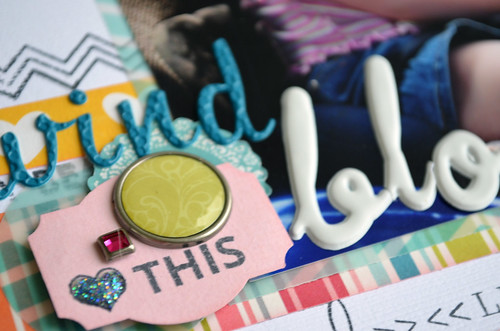
My layout for the first sketch, which I veered from fairly drastically.
If you are taking, or have taken, the class you will be able to see all the differences from the original sketch. It's pretty drastic but this is what worked for my photos and papers.
This was a hard layout to make, nothing wanted to come together in a way that I liked. At first I tried to use the bottom patterned paper strip as the background, the Carta Bella Cool Summer paper is so cute but it was overpowering for an entire background. Once I settled on the white cardstock it felt cold. I used my go-to method of making a frame out of another color, the pink made everything come together and not seem so sterile.
Something still wasn't coming together and I thought why not go on stamp overload. I love my stamps but I know I need to use them more, I figured this would be a good time to try and if I didn't like the results it was only plain cardstock that I would have to throw away. In all I believe I used 5 stamp sets on this one page, something I'm definitely trying again.

I also challenged myself to use some Thickers that were an impulse purchase. I had never seen these before and they were at TJMaxx for $1.49 each, why not buy them that cheap. As I put them away I was wondering how in the world would I use them, they weren't my normal chipboard or foam in easy to read fonts, these are a little different. They somehow worked for this page, at least I hope they do.
Thanks for stopping by, I hope to get another haul up soon.

No comments:
Post a Comment
Thank you so much for taking the time to comment!